Lea: personalised e-learning

Mobile App
The challenge given to us was to work considering the previous research data collected by Lea team in order to co-create an engaging and professional learning app to help people upskilling for career purposes. Lea team also shared with us a flow they had designed, but the prototype had not been tested, neither from the point of view of the concept, neither from usability. Both the previous research and the flow they shared guided our decisions during the project.
That's why our main role in this project was first to validate the current concept created by Lea team, by conducting user research and concept testing, and then to redesign a part of the user flow and create another part of it from scratch (this process will be detailed on the Prototype section).
So let's get started with our research!
My contributions: UX/UI Designer responsible for all steps of the project
Team: Julia Ibri, Carol Brito and myself
Duration: 10 days
Brief: Validate the current concept created by Lea team, by conducting user research and concept testing and to redesign a part of the user flow and create another part of it from scratch
Tools: Figjam, Figma, Slack, Calendly and Notion
Deliverables: Revised brand identity & Hi-fidelity MVP prototype
Project Overview
Research

Stakeholder Interview and Previous Research
We started our project with a stakeholder interview in order to understand the marketing perspective and the target audience for the product. Regarding the users, the team was already talking to their target audience and had a lot of insights (image on the right). So, for our interview, it was only a matter of organising their previous findings and validating them with follow-up questions. Since we had a big picture of the problem, we decided to move forward to a new round of user interviews without conducting an exploratory survey.
What does the Competitors Offer?

We also received a document with Competitor Analysis from Lea team. Though, since they didn't work from a UX Design perspective during the research and analysis process, we decided to review the findings and to reorganise the competition (learning apps and platforms) based on the features they offer.
This gave us an idea of features that could be used later on, so that Lea could be an innovative proposal, even though there are already so many e-learning products on the market. These findings were revisited during the research analysis and the ideation process.

Understanding the User
Moving forward with our strategy, it was time to ask more questions to the users in other to validate the concept. We interviewed 9 people that already looked for upskilling online courses and we asked questions to learn about their experience, thus we validated that our product would attach users' interest. From them we learned that: they find it crucial to keep learning and upskilling for work; they get frustrated with long and superficial contents; they need to review and put theory learned in practice; they don't like excessive gamification on learning apps.
User Persona
After the user interviews, we created an Affinity Diagram to visualize and to prioritize, by dot voting, the most relevant clusters. With these insights in mind, we had empathy elements to build our User Persona, and then put it at the center of our decisions.

How Might we Find a Solution for Lisa?
The Journey Map is the moment to think about opportunities in terms of designing the experience. To do so, we organise these opportunities in "How might we" questions. Below I highlight some of the main questions:
User Journey Map
How might we provide motivating soft skills e-courses?
How might we help Lisa to have a more personalised learning process?
How might we make the course more interactive?
How might we help her measure the learning success?

Defining the Problem and Prioritizing Features

Prototyping and Testing and Iterating…
Low Fidelity Prototype for Concept Testing
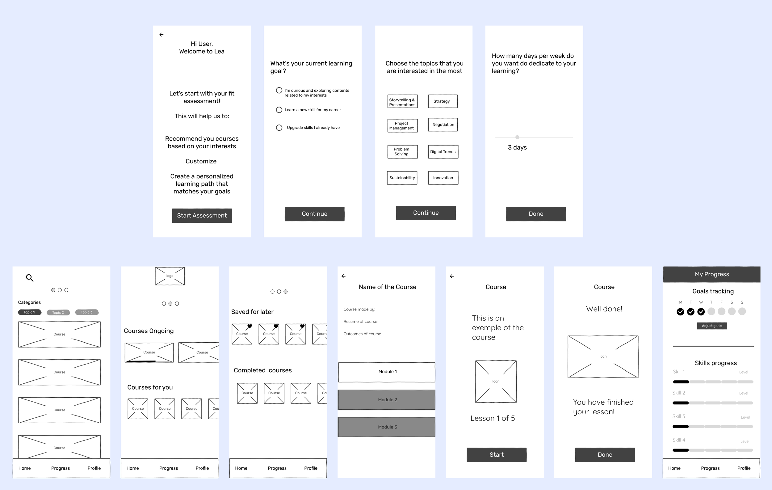
We built a Low Fidelity Prototype so that we could test the main concept for Lea: how to provide personalised courses and how to enable the user to track the learning progress. Then we organised the flow with a setup section for personalisation (1st row image below) and another one with the presentation of the courses (2nd row). We created this part of the flow from scratch, so that we could incorporate the part of the lessons made by Lea Team on the Usability Testing (next section).

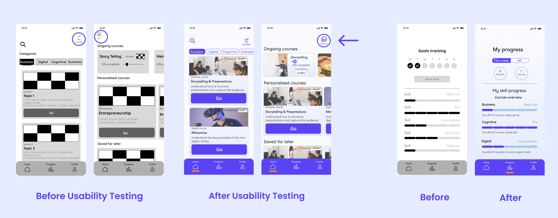
Below you can see some examples of how the solution evolved from the Low-fi version (before concept testing) to the Mid-fi version (after concept testing):
For the courses displayed screen (on the left) we have designed a swipe action to change the screens, however the users were confused as to what the 3 dots on the top were referring to. So, we decided to add icons to sinalize there was a screen with “all categories” courses swiping right, and “my courses” if the user swipes left from the “all categories” screen.
For the setup screen (on the right) regarding the time dedicated to learning, the users were not sure why that question might be relevant for the setup. Then, we tried to make the reason for the question clear (to set up a reminder) and we gave the user the freedom to make choices more aligned with their needs.
We conducted the concept tests with 5 users. The idea was to let them share the screen and "think out loud” while using the prototype. There are two interesting points regarding concept tests I confirmed in this project: 1- sometimes people struggle to understand how to interact with a Low-Fi Prototype; 2- people usually make comments concerning usability aspects as well. Since we are often constrained by time, I think it's a good practice to take profit of this comments.

Mid Fidelity Prototype for Usability Testing
After analysing the insights from users and implementing improvements to the concept, we added the part of lessons provided by Lea team to our Mid Fidelity prototype (these are the screens we can see in the second row of the image below - except the last 3 screens on the right, created by our design team). The lesson content was provided by them and we understood that they were well organised in terms of hierarchy. We only made adjustments, specially for the labelling of "modules” and "lessons". For confidentially reasons, I can't share exactly what the team shared with us.

Below you can see some examples of how the solution evolved from the Mid-fi version (before usability testing) to the high-fi version (after usability testing):
For the courses displayed screen (on the left) we decided that the swipe action didn't make sense anymore, since we have decided to keep only two screens: the “personalised courses” on the main screen and the “all categories” as a second option accessible now with an icon labelled "Library". It was important to us to keep this Library easy to access because many users mentioned that they would like to easily access other courses even if they don't exactly match their preset goals.
For the tracking progress screen (on the right) the users were not sure about what the week days exactly meant to track. Same problem they faced with the "skill progress": unsure if they were measuring the skill for a specific course or for all courses. So, we specified the tracking criteria on the high-fi version.
We conducted the usability tests with 5 users, same method, explaining to the user the "task” they would need to accomplish: to set up a personalised learning path/goal and reminders, to choose the course option on the main screen and check the “all categories” courses if needed, to engage in the lesson, to check the learning progress and to edit the learning goals.

Branding and UI Alignments
Creating a Moodboard for Lea

Designing Lea's Style Guide
After doing some contrast tests with colors extract from the Moodboard, this is our Style Guide. We decided to keep the vibrant purple already used by Lea team, because we understood this color was reinforcing personality and modernity to the app. Then we added a touch of orange from the mood board as an accent color. The course cards gained some sky blue gradient color to highlight the flexibility aspect. The typography was chosen so the brand would have some professional touch and attitude.

Here is the moment to show you our high-fi prototype. I recorded a video with the following flow: a regular user (not for the first time) opens the app to continue a course they have already started. They complete a lesson and then, after checking the progress, they decide to edit the personal learning goals. The flow for editing is the same a user opening the app for the first time would see. Thank you for watching!
Creating an MVP for Lea: High Fidelity Prototype
a.ray: group e-therapy for eating disorders
Rootling: encouraging free-time
Flixbus: travel tickets accessible


